Map Design for
Dublin Gallery Map
2018/19 + 2019/20
Hen’s Teeth Studio
In 2018 Dublin Gallery Map were looking to redesign their map for their annual weekend collaborative event. This city-wide event is a collaboration between almost 40 art galleries and museums across the city, who have joined together to present a specially programmed series of free public events such as talks, concerts, tours, workshops and more, alongside their exciting exhibitions and projects by a diverse range of artists. Dublin Gallery Weekend invites visitors to come and experience something new, and to discover art in galleries of all types ranging from the biggest modern art museums in the country to the smallest, tucked away experimental art spaces

2018/19
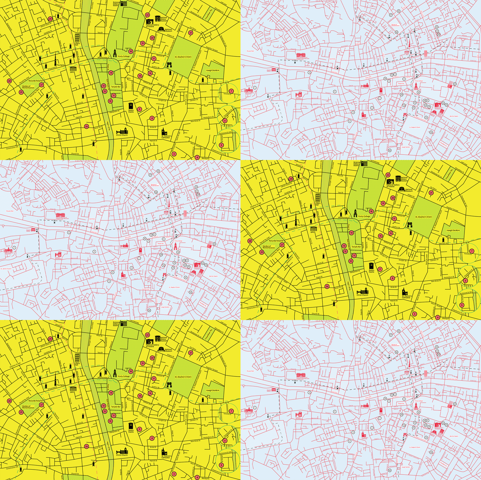
Dublin Gallery Map wanted a redesign that would be eye catching and a keepsake for all gallery goers and also tourists alike. The 2018/19 edition colour palette and logo reform was based on the River Liffey, a landmark river running through the city which Dubliners and those from afar use as a reference point and cross countless times in a lifetime. A pastel blue was the colour of choice that was sleek and smooth. The logo reform took on a red heat map aesthetic, connoting the idea of when many people are gathered together in one certain area. This translated to Dublin City being a hub for cultural events, but also how the event goers would congregate at different galleries over the weekend


2019/20
Following up on the 2018/19 redesign, this approach was in the same vein. A design for those visiting Dublin’s cultural galleries to be met with a tactile map that was visually engaging. The colour palette shows how a varied palette can come together on one page to house one visual aesthetic, much how galleries house a multitude of styles and exhibitions together. Clear strokes divide up this map further imposing the idea of how galleries organise and layout out such a varied amount of work under one roof. This map is no different as it houses all the information users need to navigate culturally throughout the city. The logo emblem takes a new form, one that is precise but that adds a new dimension and depth to the pastel colour palette and strict dividers. Further evoking that there is always a depth or a deeper meaning to what the user might encounter while immersed in an exhibition


